
Brand Identity & Packaging Design
Client: Hungryroot
Role: Brand Designer
Work done at Four Flights Up in collaboration with Kate Hilliard, Jonathan Field, Tyler Bengtsen, and Tien-Min Liao
Overview
Hungryroot is a personalized grocery and meal service focused on making healthy eating easier and more accessible. As the brand evolved, there was a need to clarify its visual identity and create a more cohesive system that could scale across categories, products, and digital surfaces.
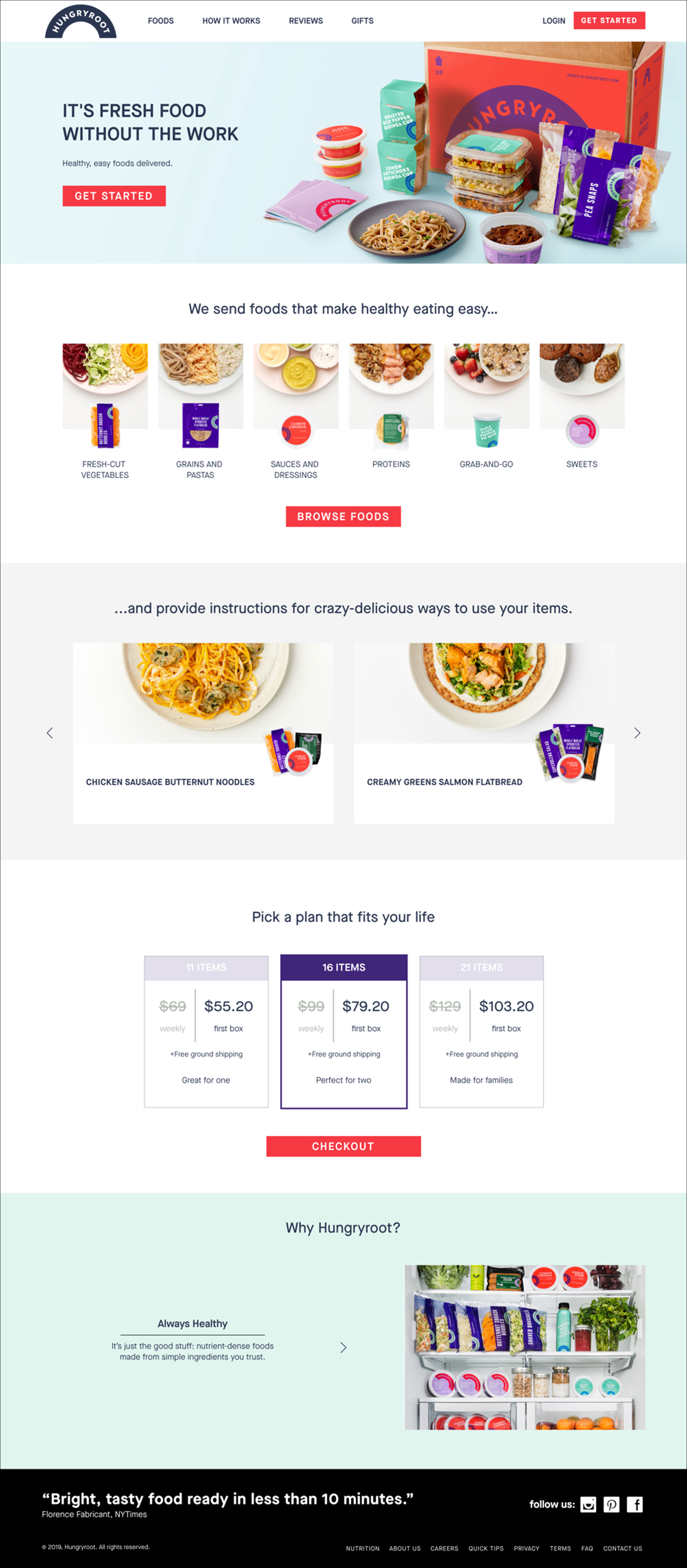
This project focused on redefining Hungryroot’s visual language and translating it into a refreshed website experience.
Brand & Visual Direction
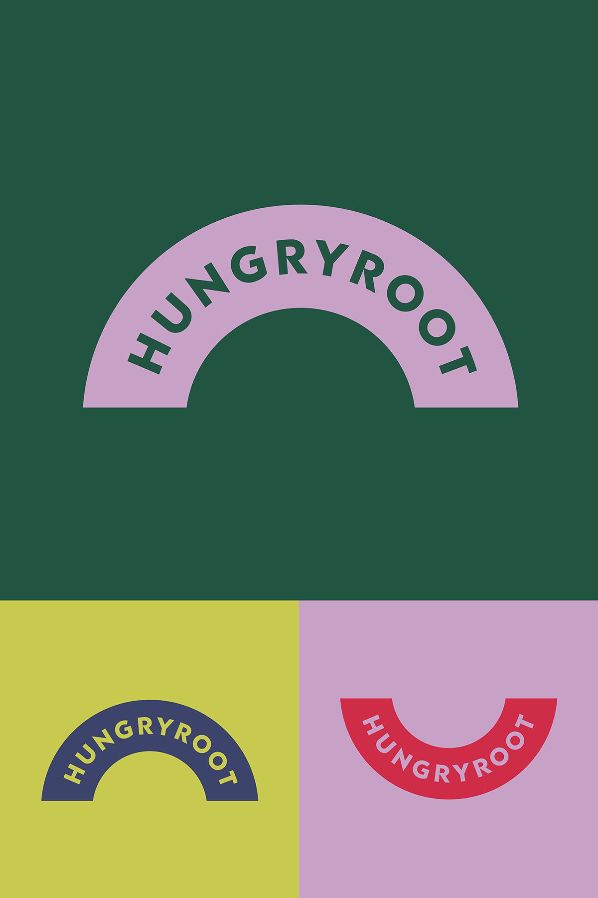
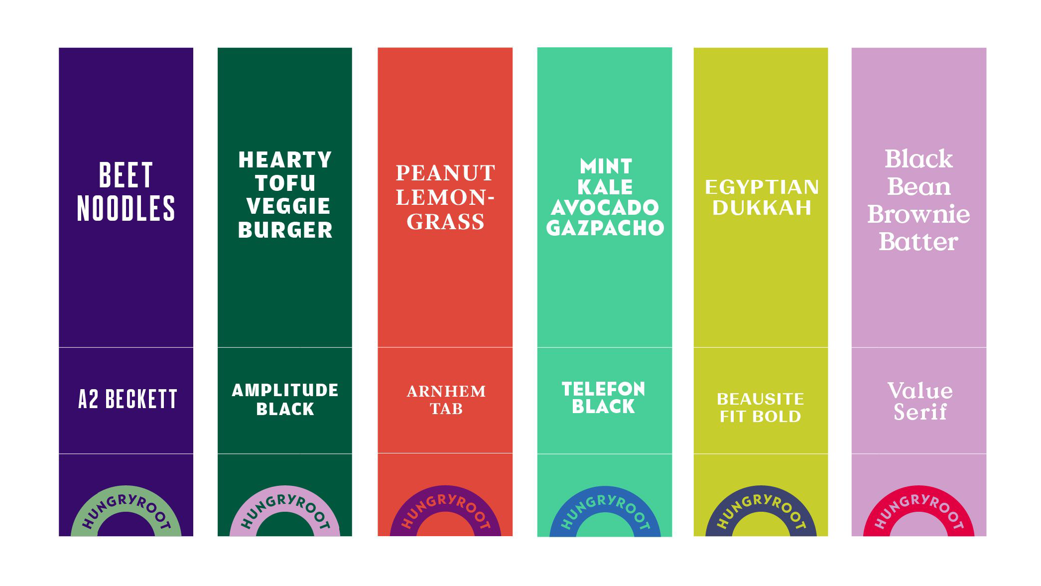
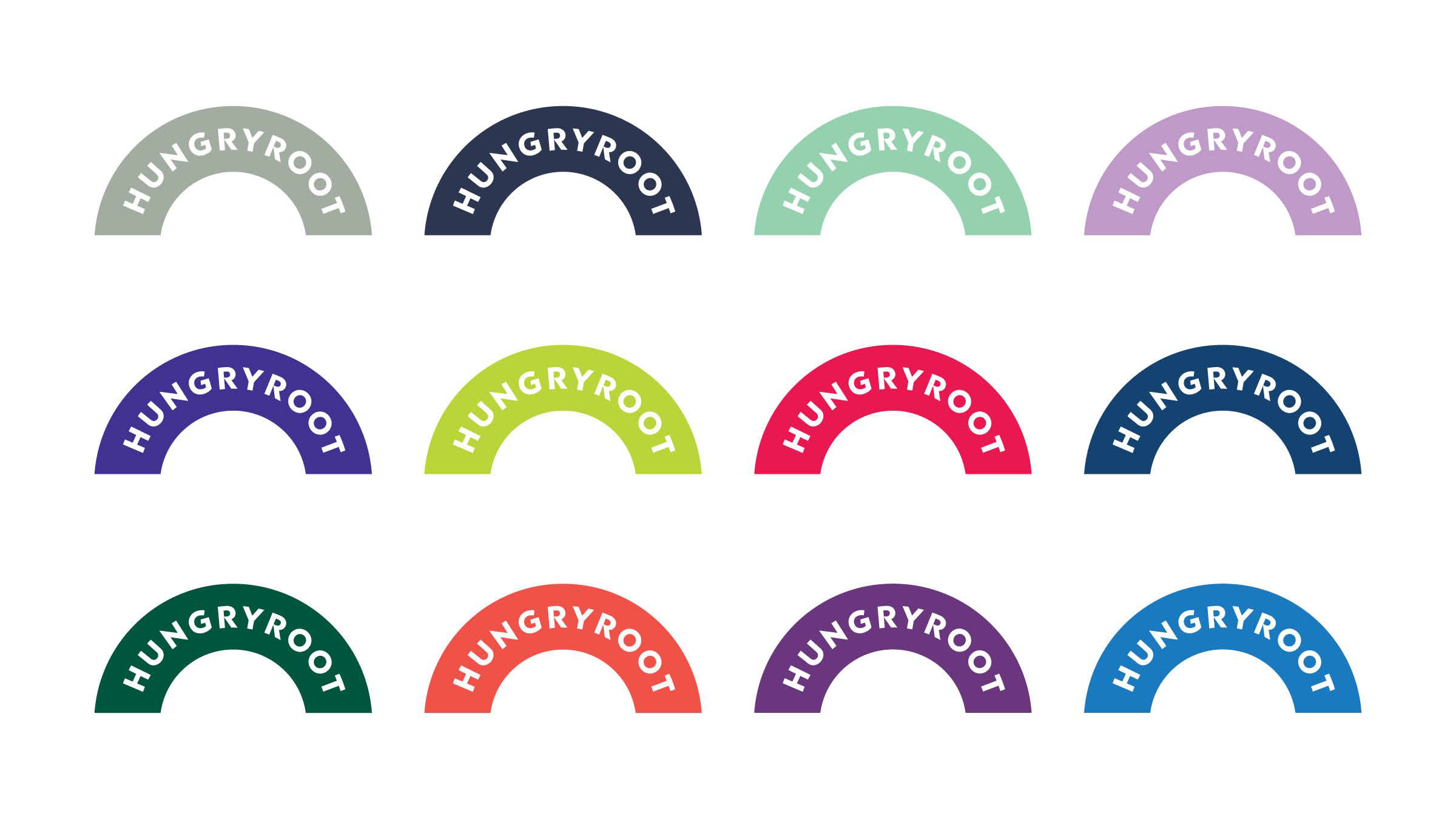
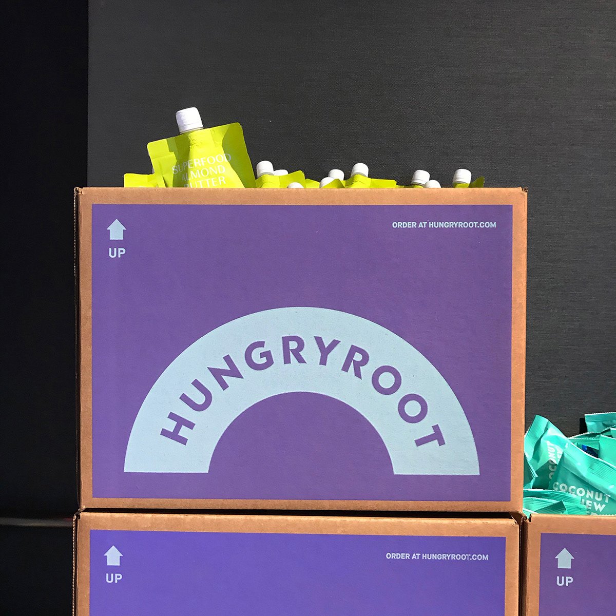
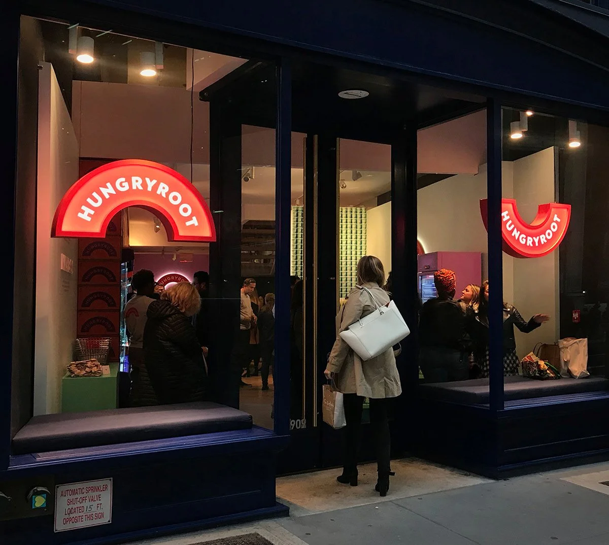
The rebrand centered on establishing color as a core brand system. Food categories were mapped to a consistent color-coding approach, creating a clear and recognizable visual logic across the brand.
Rather than using color decoratively, the system treated color as an organizing principle—helping differentiate categories, support recognition, and bring structure to a growing product offering. This approach allowed the brand to feel energetic and expressive while remaining coherent and easy to extend.
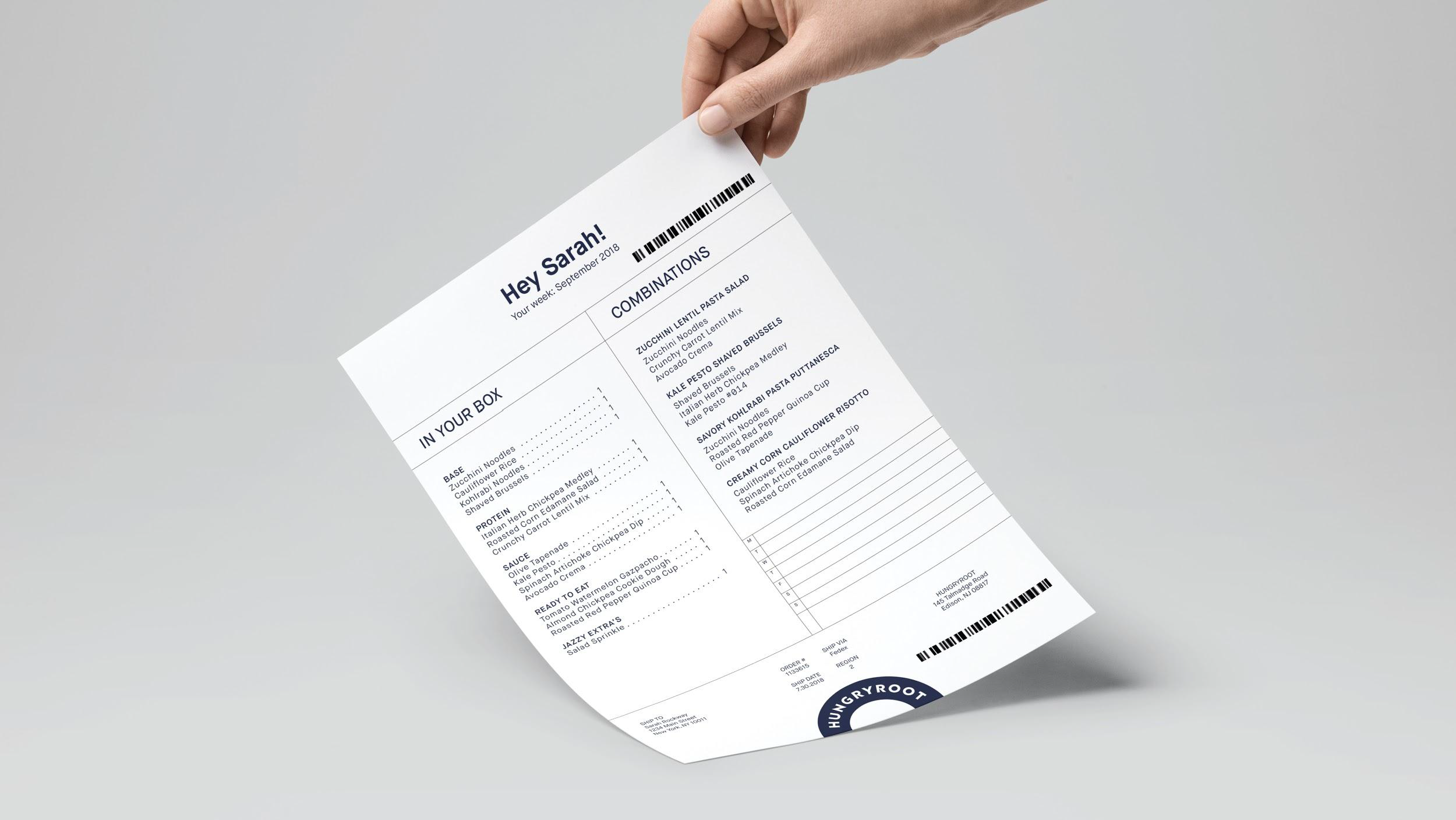
Typography, imagery, and layout were designed to support this system, reinforcing a sense of warmth and clarity without visual clutter.


Outcome
The refreshed brand system provided Hungryroot with a more consistent and scalable visual foundation. By grounding the identity in a clear color logic tied to food categories, the rebrand strengthened recognition and created a flexible framework for future growth.