Brand Identity & Digital Campaign Design
Client: Elektra Health
Role: Designer
Year: 2021-2022
Work done at Studio Rodrigo in collaboration with Connie Chu, Caitlin Hohn, and Christina No
Overview
Elektra Health is a women’s health platform focused on menopause care and education. I joined the project after the core rebrand had been established, contributing to the work by translating the evolving brand into clear, usable guidelines and applying it across campaign executions.
My role centered on helping the brand scale consistently—ensuring that the identity could be used confidently across teams, channels, and real-world communication.
Brand Guidelines
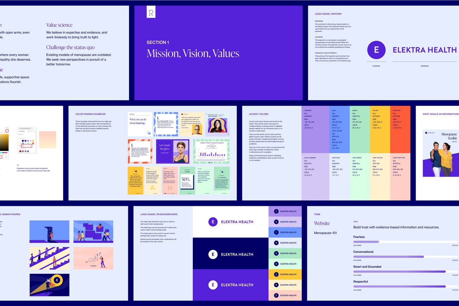
A key part of my contribution was developing brand guidelines that clarified how the identity should be applied in practice. This included defining rules around typography, color usage, layout, and tone—bridging the gap between high-level brand intent and day-to-day execution.
The goal was to create guidelines that felt both structured and flexible, allowing the brand to remain expressive while maintaining consistency as it expanded across touchpoints.

Campaign Design
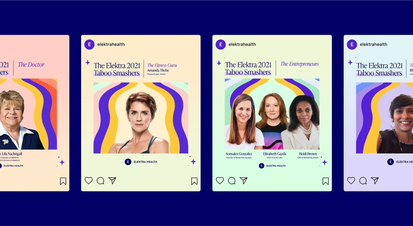
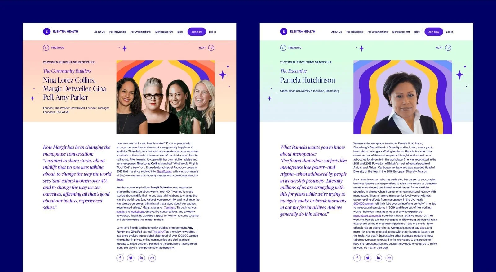
In addition to the guidelines, I worked on campaign design that applied the refreshed identity in a more expressive, outward-facing context. These campaigns balanced clarity and warmth—supporting Elektra Health’s mission to make menopause care feel credible, approachable, and empowering.
Design decisions focused on reinforcing trust and accessibility, ensuring the visuals supported sensitive subject matter without feeling clinical or impersonal.


